Recently, I was playing with creating a CSS version of mesh gradients. It occurred to me that it wouldn't be too hard to create a Vue component that allows these to be interactive. So, let's do that, but first a quick recap to explain what it is that a mesh gradient actually is so that we can understand what it is that we're building.
When you have a traditional gradient you will have a linear or radial progression of colors. You can think of it as a 2d line. It goes one way.
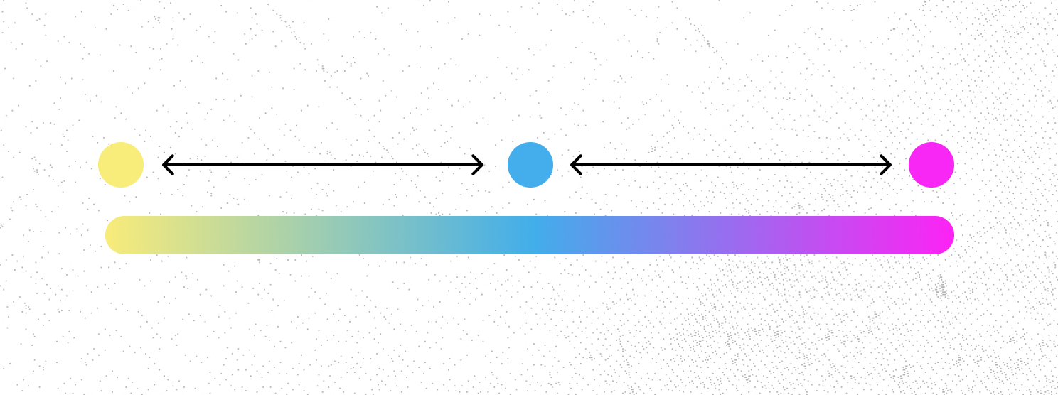
With a mesh gradient, you have to think of it as a matrix. It has both width and height. It goes in two directions.
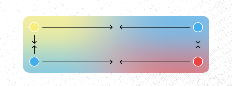
Unfortunatly, CSS (or Figma) doesn't have a native way to actually build this, so we have to fudge it.
The solution that I proposed in the previous article was to have a container, with its overflow hidden, and a series of internal elements which are all using filter: blur(); to bleed the colors into one another. You can see below the implemented mesh-gradient and a wire-frame version. If you're interested in the exact code for how to do this, please take a look at this article.